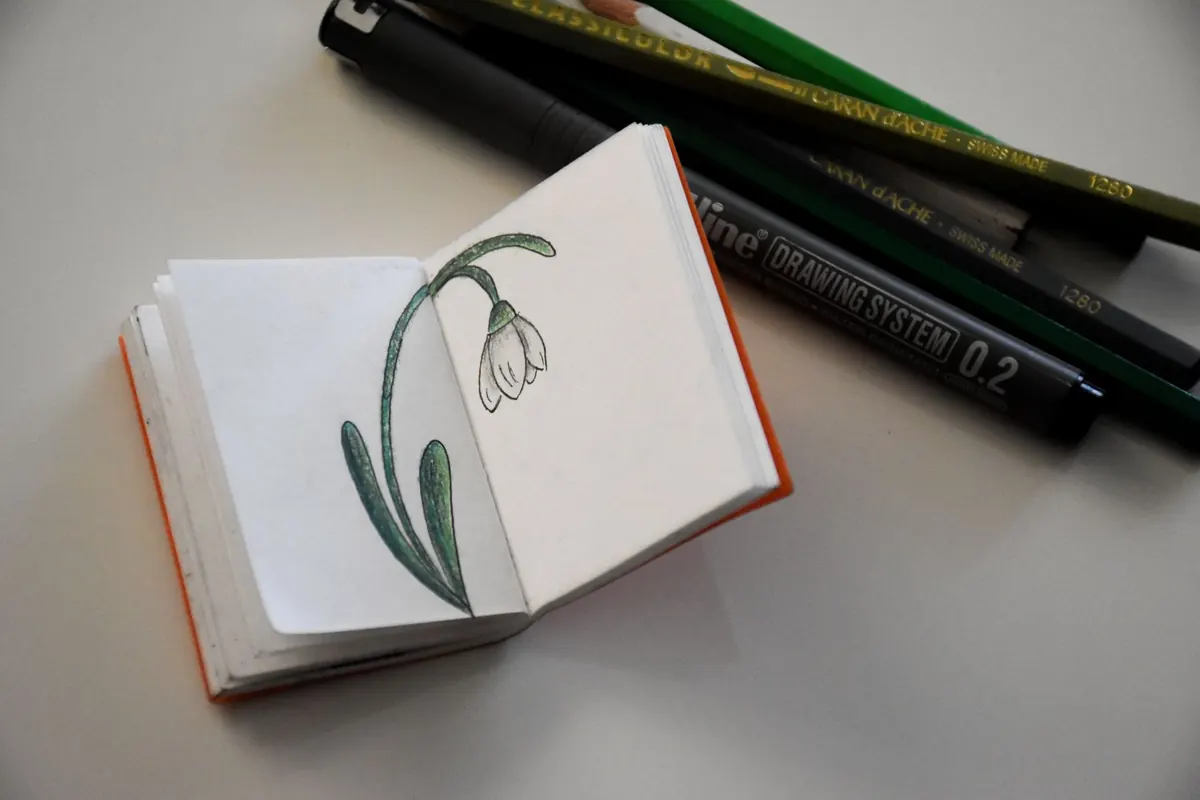
Walk into most product studios in Bristol, Manchester or Leeds and you will spot the same unsung object: a battered notebook, half-filled with boxes, arrows and corrections. It rarely appears in a portfolio case study, yet it is where the difficult thinking happens. The habits below are the ones that keep turning up in working studios — ten of them, all cheap, all repeatable, and all pointed at one outcome: better wireframes, drawn faster and defended more easily.
A wireframe in a design tool arrives with temptation attached. The component library is right there. The spacing is already neat. It is easy to spend forty minutes making something tidy that solves the wrong problem.
Paper removes that escape route. You cannot hide behind polish, so the questions surface early: what is the primary action, what does the user see first, what happens when the copy runs to three lines? Those are cheap to fix on a page and expensive to fix after a stakeholder review. Sketching is not a warm-up for the real work. It is the part where the work gets decided.
This is the single habit that pays back fastest, and it works well as a team ritual at the start of a project.
Done weekly, this builds a habit of generating options rather than defending your first idea. It also gives you something concrete to show when someone asks why the layout looks the way it does.
Britain is unusually generous with badly designed public interfaces, which makes it excellent material. A rail ticket machine at a quiet station, a hospital appointment letter, a supermarket self-checkout at 6pm: all of them are screens and forms with real users attached.
Carry the sketchbook on the walk and draw, rather than photographing. Drawing forces you to notice hierarchy: which line do your eyes hit first, what is greyed out, what the machine assumes you already know. Note the moments where somebody ahead of you hesitates. That hesitation is a usability finding you can steal for your own work, and it costs nothing to collect.
Back at the desk, translate one observation into a wireframe constraint. If a queue of people can't find the "pay" button on a machine, your checkout flow probably needs a clearer terminal action too.
Most notebooks record what worked. The more useful ones record what didn't. After each round of testing or a messy stakeholder session, spend five minutes writing down what confused people, the exact wording they used, and one alternative you would try next time.
Keep it short and unsentimental. A line like "three of five people missed the filter entirely — try it above the results, not beside them" is worth more in three months than a page of neat final drawings. When a similar problem appears on a new project, the log saves you from repeating the mistake.
Open the book to a clean page and pick one. Give it ten minutes, no more.
Draw the screen a tired commuter would use one-handed, in the rain, with the phone at arm's length.
Consistency matters more than volume. Fifteen minutes at the same point each day beats a three-hour session once a fortnight, because the habit survives busy weeks and the drawing hand stays warm.
Keep one notebook rather than five, date every page, and don't tear anything out — the messy pages are the evidence of thinking. Add a pencil to your bag so an unexpected wait becomes sketching time. At the end of each week, review what you drew, choose three ideas worth turning into wireframes, and note what you will test next. Then start again on Monday.
Photo: MUEZ / Pexels

Low-fidelity prototypes are fast and invite honest feedback; high-fidelity ones test detail and win sign-off. Here's...
A practical, hour-by-hour guide to turning paper sketches into a clickable mobile prototype in a single focused day...
A UK-focused checklist for public sector design teams, showing how to embed WCAG AA, accessibility statements and...

Sketching and wireframing for digital designers..
