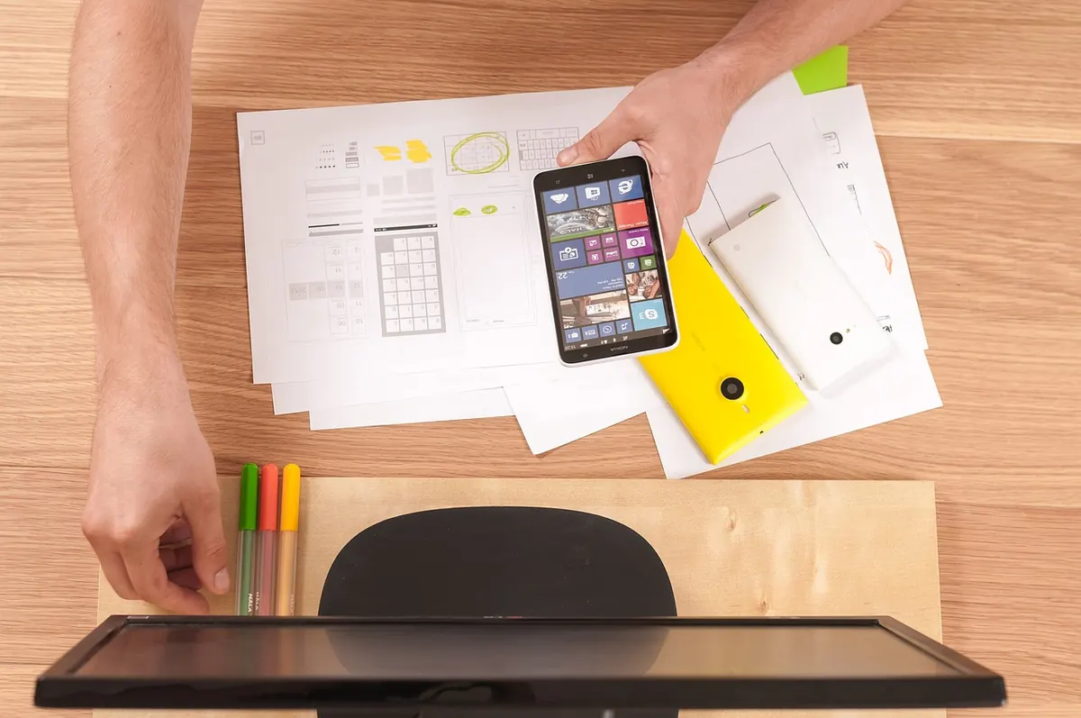
One day is enough to answer a question, not to finish a product. That distinction is what makes a lean prototyping sprint work. If you arrive in the morning with a rough idea and leave with a tap-through prototype and three real observations from real people, the day has paid for itself. If you spend it nudging corner radii, it hasn't.
The method below is deliberately unglamorous. Paper, a marker, a short list of screens you agree not to exceed, and a hard stop at the end of the afternoon. It works for anything you can hold in one hand: a booking flow, a field service app, an onboarding sequence, an internal tool nobody wants to open.
Thirty minutes of preparation saves two hours in the morning. Decide the problem statement in a single sentence, and write down who has it. "A dog owner wants to book a walk for tomorrow morning, standing on a train, one hand free." That sentence will police every decision you make later.
Have these ready before you start:
Charge the laptop, silence notifications, and clear the calendar. A sprint day dies quietly through small interruptions.
Spend the first forty-five minutes agreeing what the prototype is for. Pick a single job and write it on a sticky note where you can see it. Everything else goes on a "later" list, not into the prototype.
Next, map the golden path as a numbered flow of screens. Describe what the person does, not what the software does.
Now add the screens nobody enjoys: empty state, loading, error, permission refused. These are where real products fall down, and a prototype that ignores them will flatter you. They take ten minutes each and they will generate the most useful feedback of the day.
Set a timer for thirty minutes and sketch the same screen three different ways, then move on. Use a thick marker and a phone-shaped rectangle. One idea per sheet. Number every sheet so you can refer to them without pointing. Write button labels as words rather than drawing icons; a bad icon hides a weak decision.
Paper is fast, disposable and slightly embarrassing, which is exactly why it works. Nobody falls in love with a biro drawing, so nobody defends it for the wrong reasons. You will cover more ground in half an hour than in two hours of digital wireframing.
Pin the sketches up and walk two or three colleagues through them in order. Ask three questions and only three: what would you tap first, what is missing, and what could we delete? Write the answers down. Resist explaining anything — if a sketch needs a spoken introduction, it isn't clear enough yet.
Pick one direction. Keep one element from each of the rejected versions if it earns its place, then write a short brief: the screens in order, the copy for every button, and the one thing the user must be able to do. Read it aloud once.
From this point until the end of the day, the brief is settled. Debate is the enemy of a one-day sprint, and the fastest way to lose three hours is to reopen a decision you already made.
A few rules that keep the build honest:
Thirty minutes to set up frames and a simple grid. Ninety minutes for five or six screens. Thirty minutes for states and edge cases. Thirty minutes to link everything and check each transition. Thirty minutes to tidy the titles and copy. That is three and a half hours, which leaves room for the inevitable snag.
Do not skip this. Grab three people who are not on the project, ideally people who are not designers. Twelve minutes each. Hand over the phone with the prototype already open and give one sentence of context: "You want someone to walk your dog tomorrow morning. Show me what you'd do."
Then stay quiet. Watch where the thumb hovers before it commits, note the first hesitation, and write down the exact words they use. Silence is the hardest part of the exercise and the most valuable. Fix nothing while they watch; a prototype that changes mid-session teaches you nothing.
Keep a single sheet per person with three columns: first tap, longest pause, and what they said they expected. That sheet is the real deliverable of the day.
By the end of the day you own a clickable prototype, a list of genuine questions, and a far better conversation waiting for you. Tomorrow morning, write up three observations, name the riskiest assumption you are still carrying, and choose the next move: another sprint on a different flow, a conversation with someone who does this job for a living, or a build.
Label the prototype file with the date and keep the paper sketches. They are useful evidence of how the thinking evolved, and they are much easier to explain than a polished screen that appeared without context.
If the day starts to slip, cut screens rather than the test. A five-screen prototype with three user sessions behind it will always beat fifteen beautiful screens nobody has touched. The point of the day isn't the prototype — it's the argument it settles.
Photo: Firmbee / Pixabay
Ten sketchbook habits from UK design studios that sharpen wireframing — from thumbnail sprints to failure logs —...

Low-fidelity prototypes are fast and invite honest feedback; high-fidelity ones test detail and win sign-off. Here's...
A UK-focused checklist for public sector design teams, showing how to embed WCAG AA, accessibility statements and...

Sketching and wireframing for digital designers..
